Color is important to photographers. But it’s often subjective. If it looks good, it’s good…right? How many times have your read a photographer’s blog and it says “this is exactly how it looked to me when I captured the image on the day”. Fair enough right? I mean, who are we to argue?
But what about when just looking good isn’t good enough.
Enter the world of commercial product photography. Where the customer is going to expect to receive a handbag that matches exactly what they saw on their iPhone when they clicked the buy button. The colors need to be accurate and a grey card or even a color checker calibration card isn’t going to guarantee that.
I understand that this isn’t paint matching or graphic inspiration. There are a few variables in play, namely the temperature of the lighting that the product is viewed under or the calibration of the screen that the customer is using. But all things being equal, the color of the product “is what it is”.
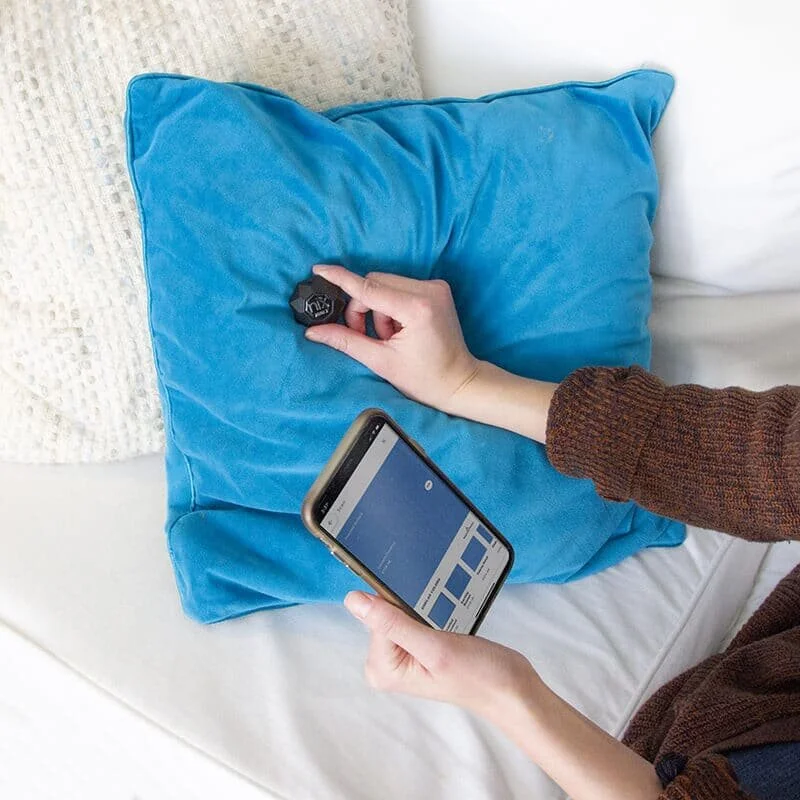
And now we can measure the color precisely with a small and affordable piece of technology called the Nix Color Sensor. I started using the original Nix Color Sensor Pro several years ago for my product photography workflow, after having a few issues with an apparel company client. Too many color revisions meant time (and money) lost for me. I had used a grey card for white balance and a color checker card for calibration and the colors still weren’t perfectly accurate. After a bit of research I found Nix and ordered the sensor.
It started saving me time immediately. During the shoot, for each product I scan the product with the Nix sensor and my iPhone and create a database of product colors for each job. Even when the client gives you Pantone color samples of the product color ways, it doesn’t mean the the actual products are going to match. If I need to reference the color, when I’m editing, I have the exact product color in a swatch that I can pull up into Photoshop or Lightroom or Capture One. Or I can enter the exact RGB or LAB or CMYK colors into the program. I can also use the Nix to check prints for accuracy. I still use a grey card for white balance but the color sensor gives me confidence every time I deliver a project to the client. It adds seconds to my workflow but potentially saves me hours of revisions.
In practice there is still an art to using it. Photographs are not a single luminance value. Light and color is reflected and diffused thought the product. You can’t just click a button and “fix” the color. The Nix blocks out all of the ambient light and has and internal high CRI LED light to illuminate the product, but the photos that we take will have a gradient of luminance, so it’s not as straightforward as matching swatches of fabric or mixing paints. But knowing the exact color of the product helps to set the overall color on balance. Now I have access to the precise color data of the product while editing, long after the garments have been put away and the studio lights have been turned off.
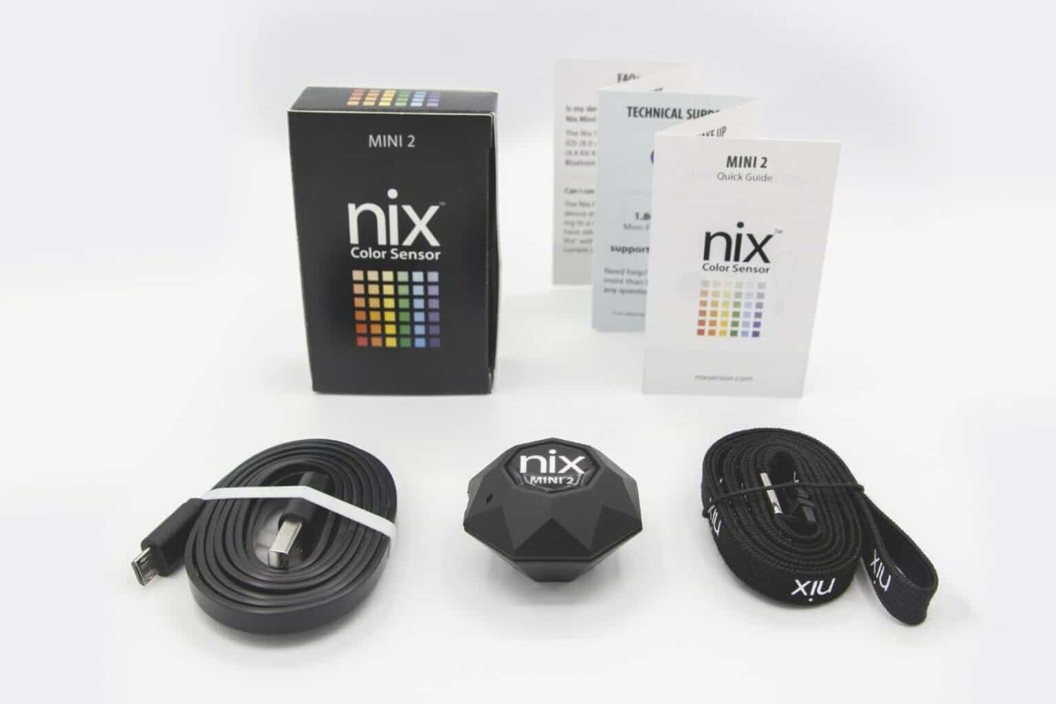
Now, Nix has reached out to me and sent the next generation of Nix Mini 2 Color Sensor for review. (full disclosure) I didn’t pay for this one. And it’s the mini, not the pro model. So I’ll be making a video of my workflow with this new unit. It’s even smaller than the original Nix Pro. That one was small enough to fit in your pocket, but this one can go on your keychain. There is no excuse to be without it now. I’ll be creating landscape and street photography color palettes from my upcoming trips to New Mexico, Arizona and Utah. And I’ve already used it on a surfboard shoot for Degree 33 in San Diego. Results have been super positive! Looking forward to this.
check out the Nix Sensors here


